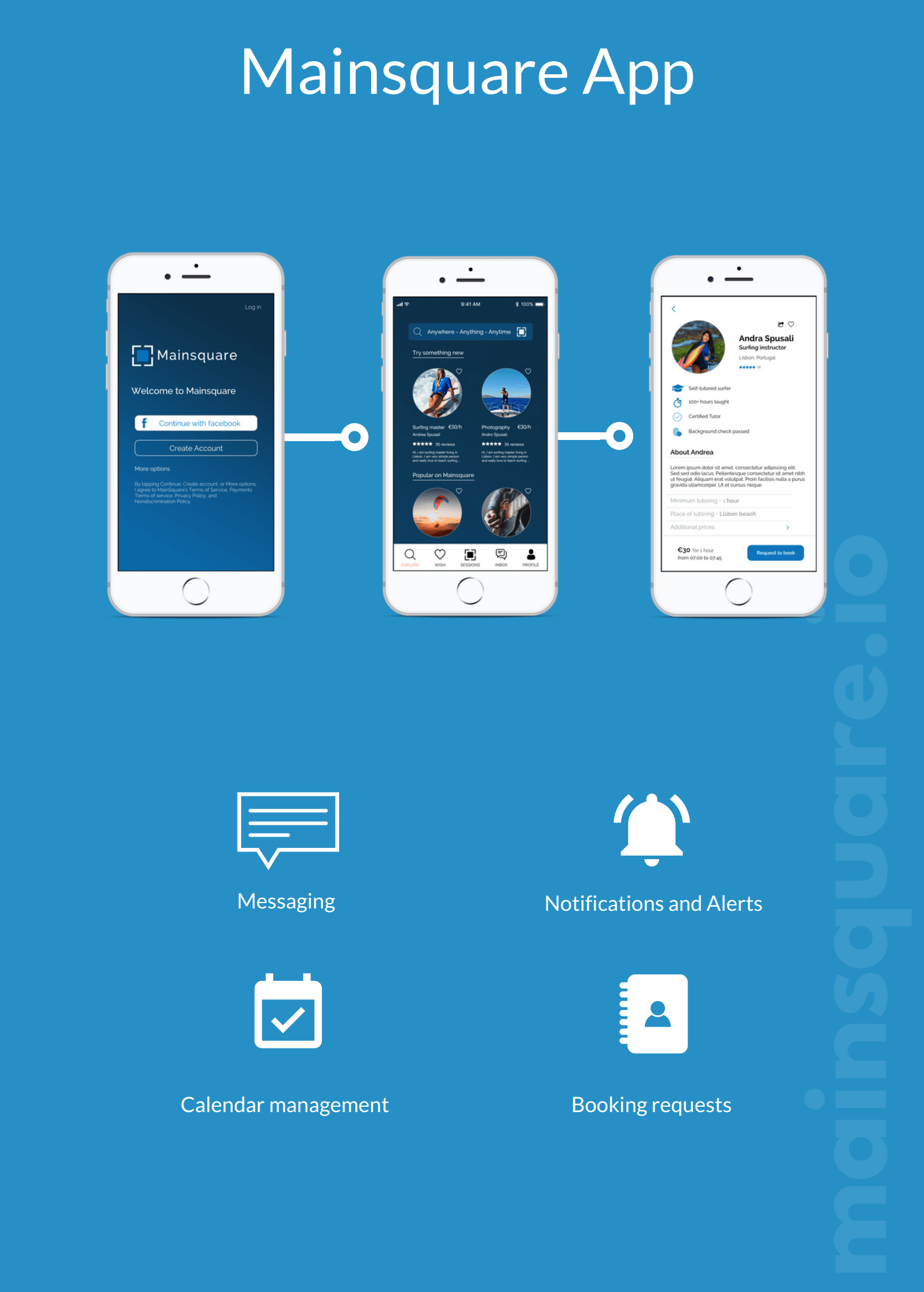
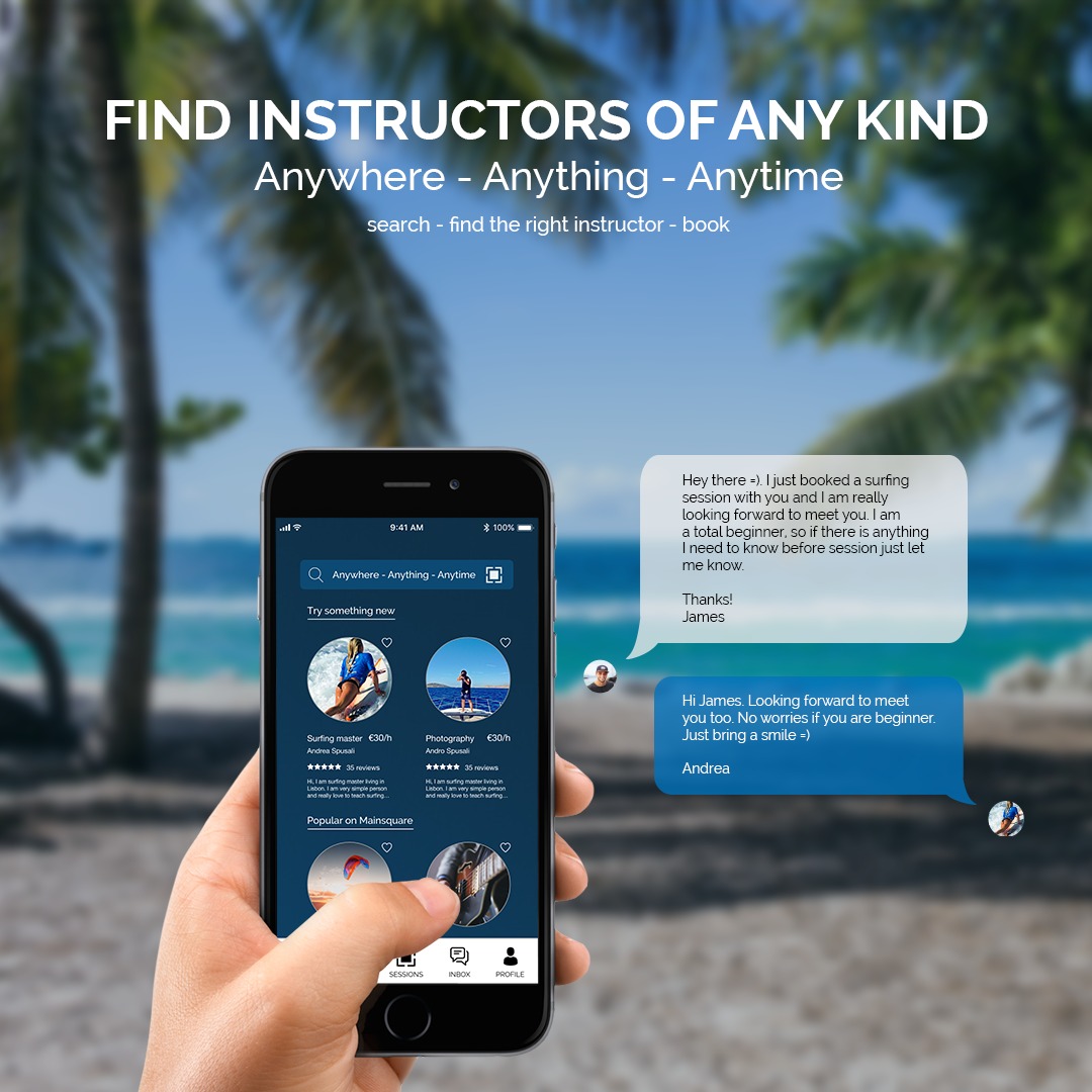
Mainsquare is a global marketplace to search and book instructors for any interest. The platform allows a two-way exchange between instructors and students. Mainsquare enables the user to book sessions with coaches, instructors, tutors, experts, or anyone that can teach something new. The goal is to make personal leisure time better and more productive. Mainsquare makes it easy for users to share their skills with others. The platform takes over the organization where the user saves time and can handle meetings with students more efficiently.
Mainsquare transforms the search for ways to spend leisure time by bringing together teachers, students, and sponsors in one platform.
- UX Research
- Market Research
- Marketing Strategy
- Mainsquare: 2018 - 2020
- CEO: Andrej Tos
- CTO: Andraz Brehlic
When it comes to finding activities and fitting instructors many problems arise. Sometimes people spend hours looking for activities on different sites and then refuse doing them because of the complexity or time-consuming booking process. Often the services are only available via Skype meetings, therefore not face-to-face or include high commission fees, fake reviews, or identity theft. These problems are attributed to the absence of a transparent and secure platform that directly connects instructors to students.
Here Mainsquare engages - an easy-to-use platform that offers a multitude of services backed by highest safety standards and constant service and quality control. Mainsquare transforms the search for ways to spend leisure time by bringing together teachers, students, and sponsors in one platform. By establishing collaborations with experienced and professional instructors, Mainsquare can provide the highest quality experience.
The Mainsquare application needs a smooth user experience with intentional design and use-flows, making it easy for the user to navigate through the website to execute processes easily.
The challenge was to research and construct the different user flows of the app features, to systemize and categorize the different activities offered in a logical way.
The interaction design needed to be simple, yet effective excluding any clunky user experience. Information should be organized logically and intuitively. The idea was to pair smart layout design with convenient features to prevent the user from feeling overwhelmed.
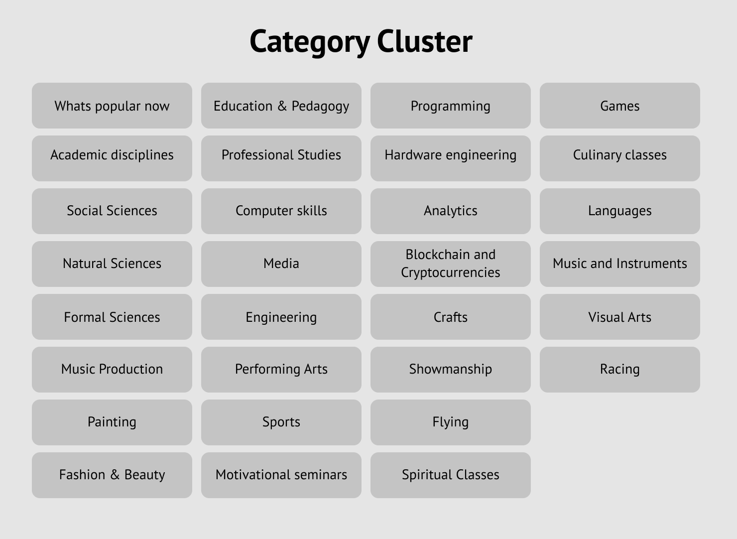
To create a good search experience for the customers, the platform needs to be constructed in a way that the tutor can choose a predetermined category for the subject they wish to instruct or teach. As there are over 500 categories on Mainsquare, we combined them into clusters or master categories.
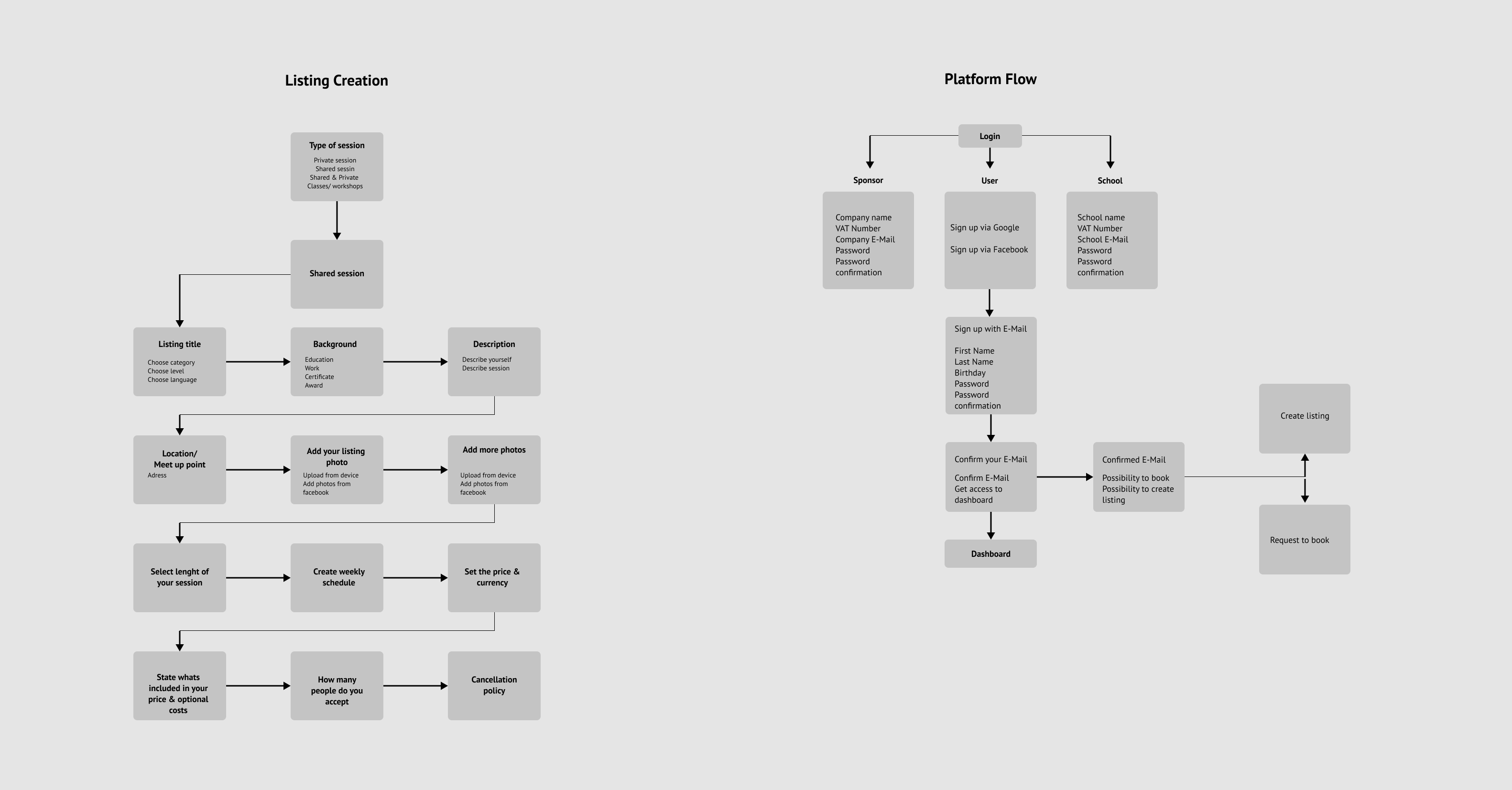
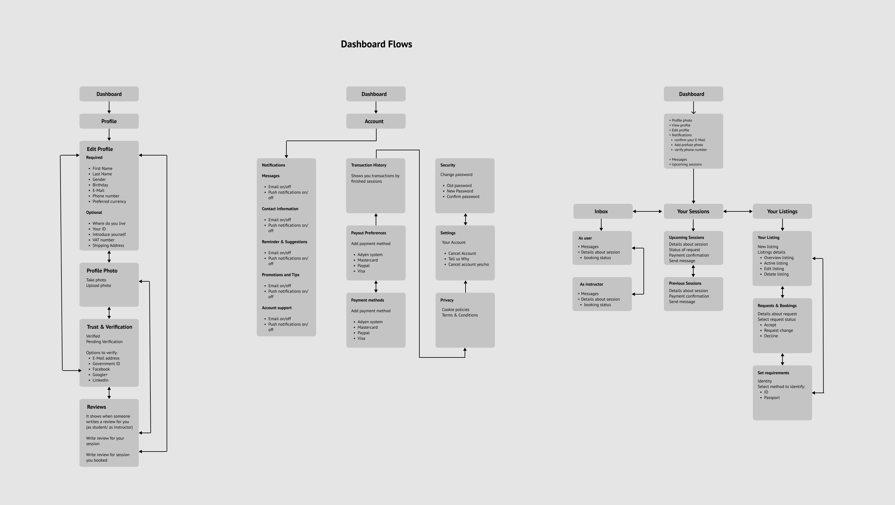
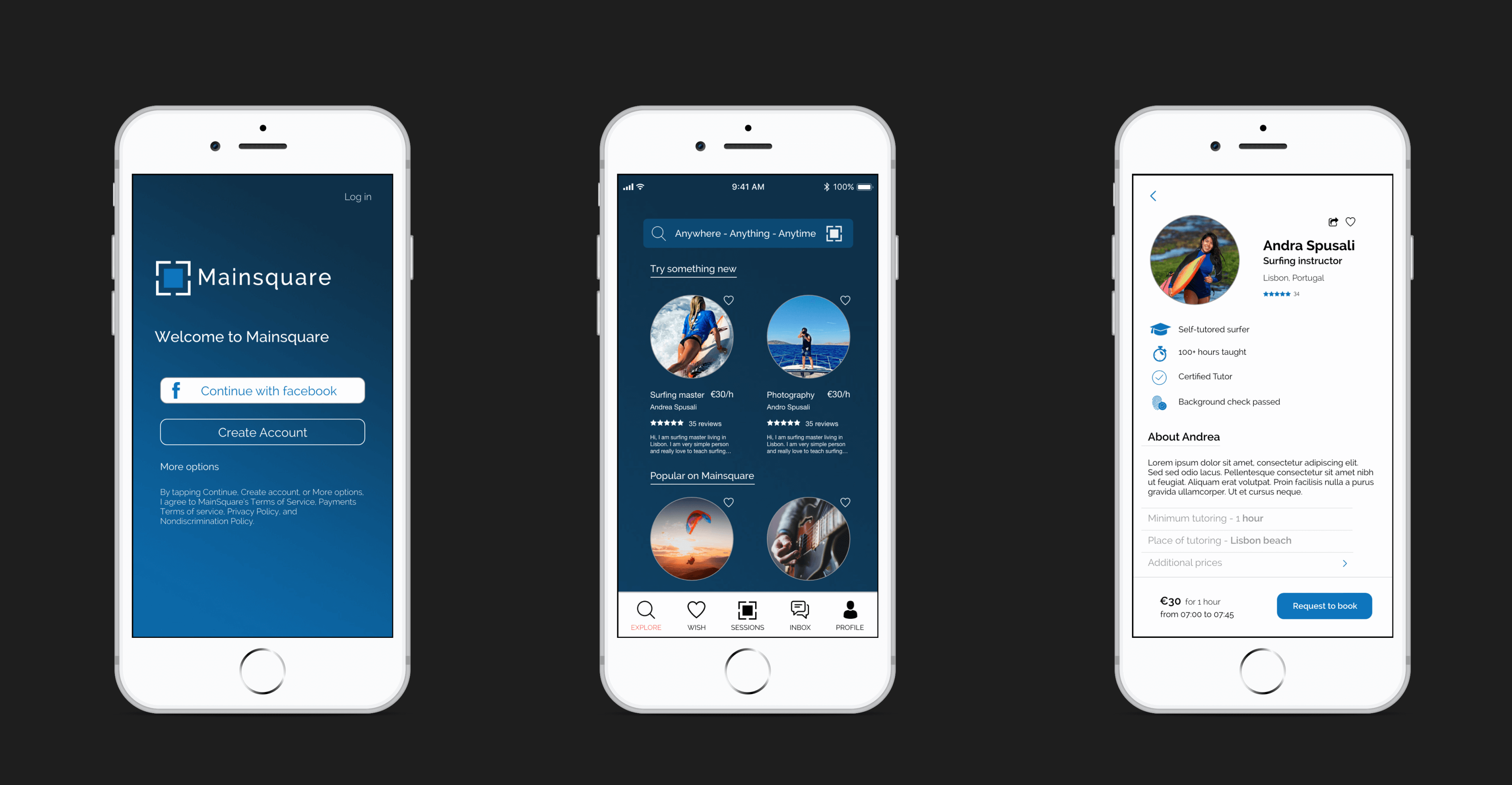
Based on the generated user flows the wireframing process started. The aim was to create a user interface that is clear and simple, and where the user can intuit the next possible step in the app.
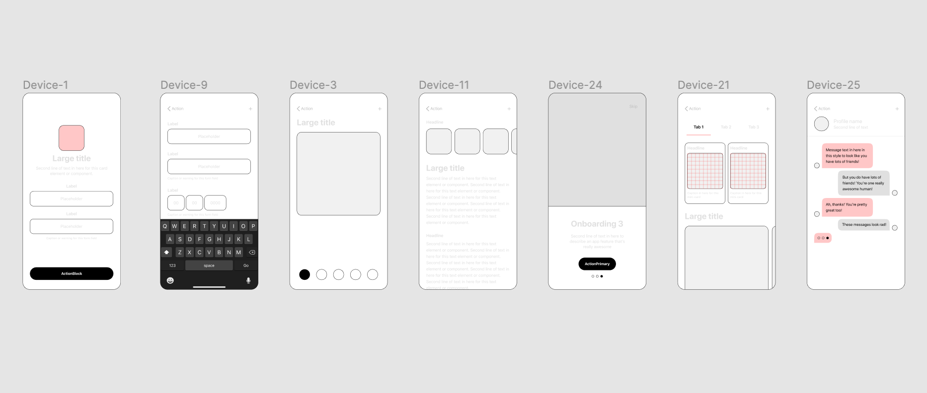
Based on the wireframes a first app interface was developed to be validated by primary research.
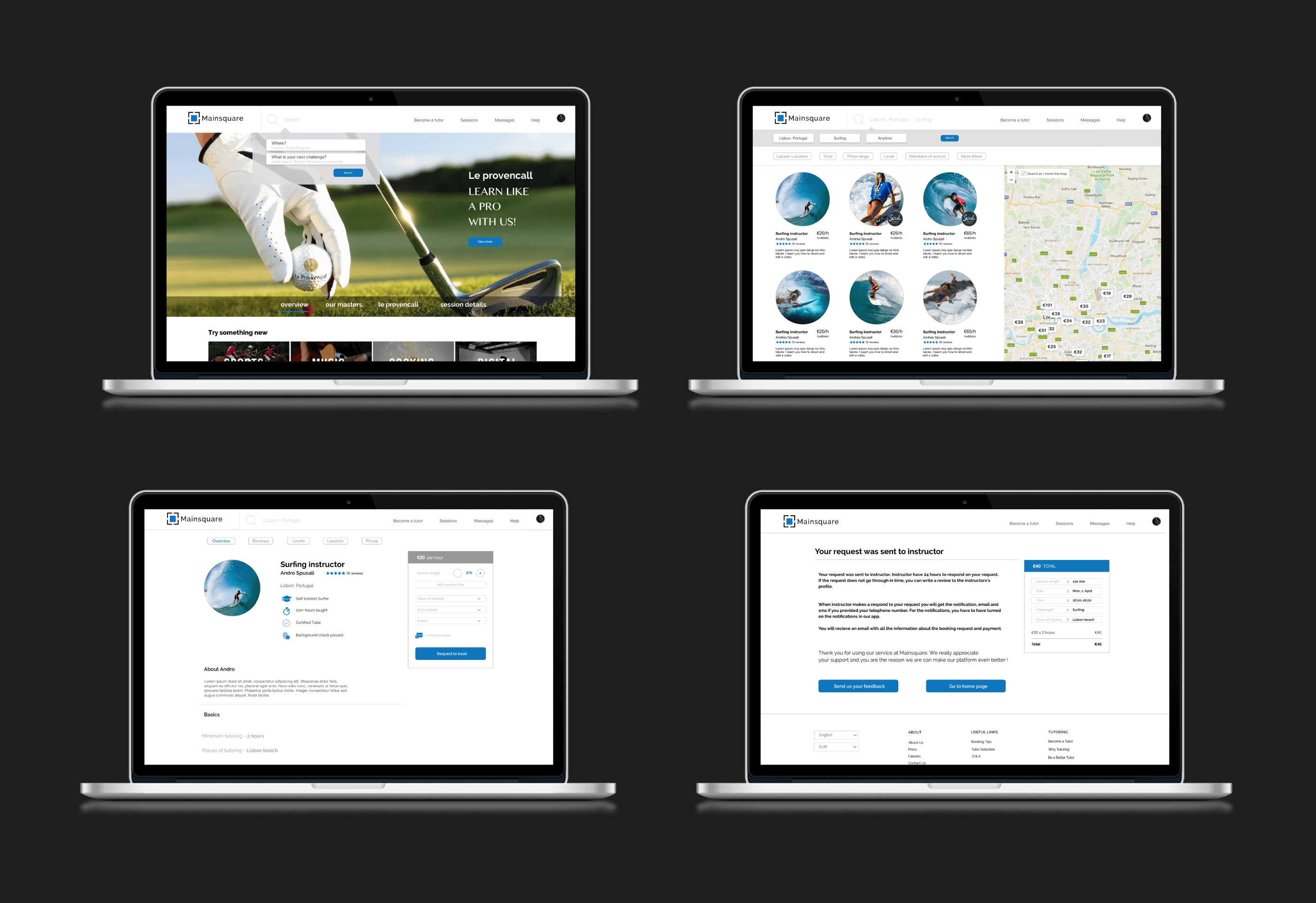
In order to acquire insights into the functional interface of the app and how the flow affects the navigation in the app primary research was conducted. The first step included moderated a focus group with 5 participants. They were asked to test the application and afterwards we were discussion potential imporvement possibilities.
Additionally we created a closed question survey including a visual of the app and explaining its features. The answers of the 45 participants gave valuable insghts about product acceptance.
The primary research results gave valuable insights and led to some design adjustments of App to increase user experience. We reduced the complexity of classes users can choose from and based on the results we developed a fitting Go-To-Market strategy. The website launched in May 2019.
